The original logo – the Coat of Arms - 1911-1960
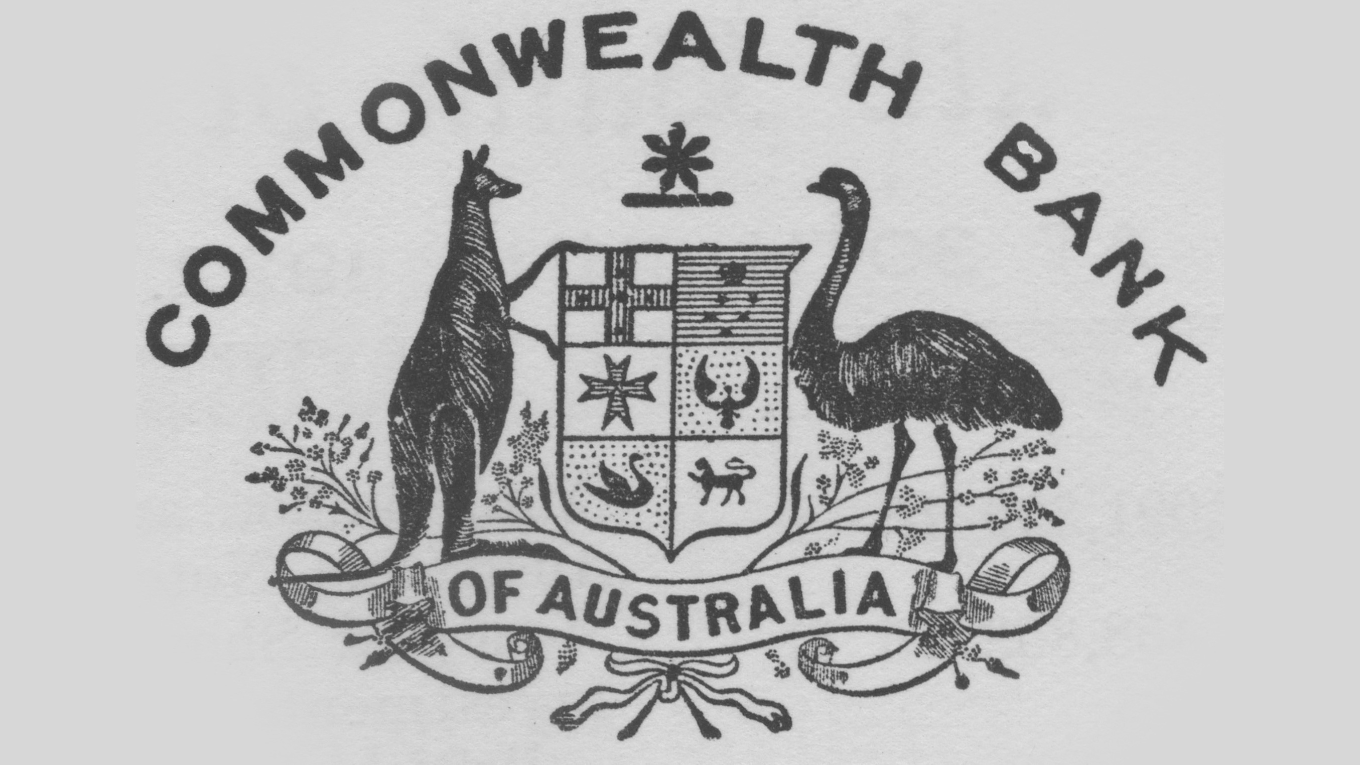
Not surprisingly, given its immediate heritage and public ownership, the bank adopted a Coat of Arms as its first logo and a symbol that was closely linked to the country and federal government which established it.
Slightly less elaborate than the national symbol with a vertically-shaped heraldic shield at the centre, the logo nonetheless left no-one at home or abroad in doubt as to the almost-indivisable nature of the association.
Those ties were cemented in the First World War when the bank became the battlefield paymaster for troops serving at Gallipoli, in the Middle East and on the Western Front, a role that it repeated during World War 2.
The logo served the bank well in times of economic crisis, including the Great Depression and during the post-war recoveries, as the country welcomed migrants from all over the world to support growth and national prosperity.
Apart from a small tweak in 1926, the logo stayed virtually the same for almost half a century.
A new design is contemplated – the Blue Logo - the 1950s

The end of World War 2 and a growing sense of modernity and prosperity across Australia saw the bank consider introducing an up-to-date look that was more reflective of the times.
During the 1950s, a new logo therefore began to appear on some customer-facing facades and bank stationary.
This circular, two-toned blue logo, displayed the CBA initials entwined together, set inside an outer ring and against a lighter background. But it never came to replace the Coat of Arms as the official logo and neither was it formally adopted, apparently only used on a trial basis prior to the major re-organisation of the bank’s corporate and business structure in 1960.
All Change – the Corporation Logo – 1960-1991

In the years prior to 1960, there had been discussions at the highest levels of government, economics and finance about the different roles the bank was performing.
It was, in effect, three banks in one: a savings bank, a trading bank and the country’s central bank. (The first two divisions were subsequently joined by another, the Commonwealth Development Bank.)
Much of the argument centred on CBA’s work as the central bank in helping to manage the economy. The Government of the day subsequently took the decision to separate the different functions, forming the Reserve Bank of Australia (RBA) as the central bank and the Commonwealth Banking Corporation to own and run the commercial and savings bank businesses (keeping the CBA name along with them).
A new logo was designed, which featured the map of Australia within a black circle with three radiating rings on the right side. This represented the group’s ideals of expansion and its main operating businesses, Commonwealth Savings Bank (CSB), the Commonwealth Trading Bank (CTB) and the newly-formed Commonwealth Development Bank (CDB).
The gold background represented wealth and the origin of banking, while the seven-pointed star symbolised the Commonwealth of Australia and the states.
The name of the Corporation encircled the design. This remained the case for almost 25 years when the name and the star were removed from the logo in 1984.
Shortly after the group came into being, the savings bank embarked on a number of major marketing campaigns, most notable being the adoption in 1964 of an elephant as its mascot-style logo accompanied by the slogan “Get with the strength”.
While it never became the main logo, the elephant and the tag line became widely-known and popular across the country.
A star is born – the Diamond logo – 1991-the current day

Another momentous change in the group’s structure, a partial privatisation by the Federal Government which was to subsequently herald the full transfer to private ownership, prompted a whole new look.
Market research undertaken in 1987 (prior to the share sale) revealed the bank was perceived as old-fashioned and out of date.
A subsequent merger with State Bank of Victoria, which led to the partial float of the combined group on the Australian stock market in 1991, opened the way for a new logo and branding.
The result was the diamond logo that has come to symbolise and identify the Commonwealth Bank even when unaccompanied by those words.
It was designed by Ken Cato, the leading branding consultant at the time, and its shape represented a “truly Australian identity” – the stars of the Southern Cross.
The yellow portion linked the five points between each star with the black completing the diamond shape. Unveiling the new logo 30 years ago, the bank described it as “bold, strong, modern and progressive”.
It was accompanied by the wider use of the original name “Commonwealth Bank” which was boldly spelt out while incorporating a typographical “arch” with the two “m’s” merged to form one that few people tend to notice at first glance.
As well as its distinct logo, the bank was to subsequently follow up on its memorable marketing campaigns of the past, which had included “Determined to be Different” and “Which Bank?”, by launching the “CAN” brand in 2012.
That symbolised a fresh start for the logo and branding working in tandem, and provided the basis for the “evolution, not revolution” approach for the new iteration of the “Diamond”, 2020-style.